
 SPEAK TO US
 Hire Quote
 My Account


 Hire
Hire Depot
Depot My
My
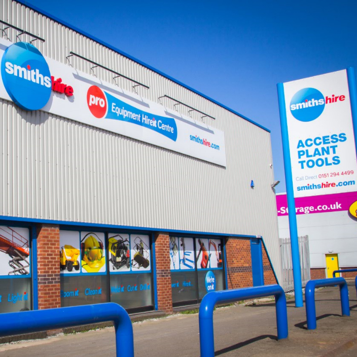
Over the last year or so, we at Smiths Hire have put more than ever into improving our service. Introducing new commitments to our customers through our Service4 promise, investing in the latest and best equipment, and recruiting a new team of dedicated account managers to ensure our customers get the best, most personalised service available.
This hard work has been recognised too with Smiths Hire being awarded a prestigious Executive Hire Show award, ‘Best of the Best’ award for the best multi depot operation over the last ten years.
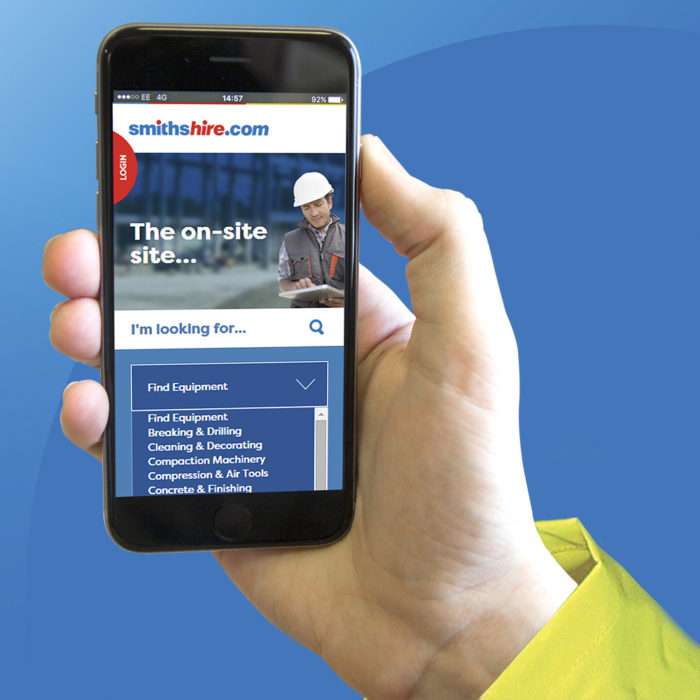
However, we’re not one to rest on our laurels and we continue to look at ways we can make our service even better for customers, this is why we’re excited to announce the launch of our new mobile-friendly website.
The new site is a complete overhaul of the old smithshire.com and has been built from the ground up with the chief goal of making life easier for its users. Alongside a comprehensive list of access equipment, plant tools, and anything else we hire – all with detailed specs and images/videos to ensure you’re fully in the know about our products.
We’ve also created a site that is better looking, simple to use, and – importantly, fits right in your pocket.
The site is of course desktop friendly and will work as any other site does on your desk’s PC or laptop but was built first and foremost for mobile use. This gives it the following advantages:
An entire fleet in your pocket
We realise that a large portion of our customer base isn’t sat behind a desk, so having a site as large and informative as the new smithshire.com able to work at its best on mobile devices makes life easier for these clients. Giving the ability to quickly find and reserve the equipment you need from your van or onsite (or just about anywhere).
Simple navigation
A site built for mobile means menus that scale easily and a simple navigation system that enables finding what you’re looking for fast. Gearing towards modern web use habits, we’ve also built in an impressive and versatile search function allowing you to find what you’re looking for within seconds.
Easily share information
We understand that good communication throughout larger construction companies is vital. For example, if your onsite manager needs a specific piece of equipment that has to be arranged through your office based buyer, the quickest and easiest way to do this is through mobile-friendly web links – literally, everyone can be on the same page, wherever they are – on any device.
David Turner – Marketing Director said – “ Investing in a new mobile-friendly website is yet another initiative we’ve taken to take Smiths Hire to the next level. This innovative site design will further strengthen our stance and commitment to ensure we provide a modern, hassle-free approach to hire, big thanks to my in-house team, Tom and Stefan, and to 2ammedia.co.uk for their creative and technical excellence on this project”
Don’t take our word for it though, take a look at our exceptional new website here: www.smithshire.com, or you can sample our award winning service by calling us on 0333 323 2100
